
 Loading...
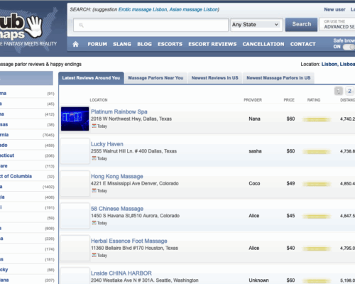
I stumbled onto MPReviews almost by accident — a huge online directory that claims to map out massage parlors across the entire United States. The number they advertise is impressive: more than a hundred thousand listings. With a figure like that, you expect a busy, active place full of comments, photos, and local insight. But the moment you land on the site, it becomes clear that almost everything is tucked behind a login screen.
As a guest, you can’t really explore. The homepage tells you what the platform wants to be, but you don’t get to see it in action. No reviews, no sample entries, nothing that gives you a sense of how active the community actually is. It feels a bit like standing outside a giant library with the doors locked.
Creating an account opens things up only slightly. There’s a free tier, but most of the meaningful details sit behind a VIP subscription — almost nineteen dollars per month. For a review site, that price feels heavy, especially since many similar directories let users browse freely while businesses pay for visibility. Here, the model is reversed, and you notice it immediately: plenty of listings exist, but very few show actual user activity.
The design doesn’t help much either. MPReviews isn’t confusing, but it has that quiet, older-forum vibe — lots of text, few inviting elements, and not much that pulls you deeper into the directory. For a project built around community input, the overall atmosphere feels oddly still.
MPReviews has the bones of something valuable. A directory that large could easily become a go-to resource if users were actively contributing and if the information felt more open. But right now, it’s more potential than reality — a huge map with very few details filled in.